
9 Circular Packaging Metrics for 3PL Teams
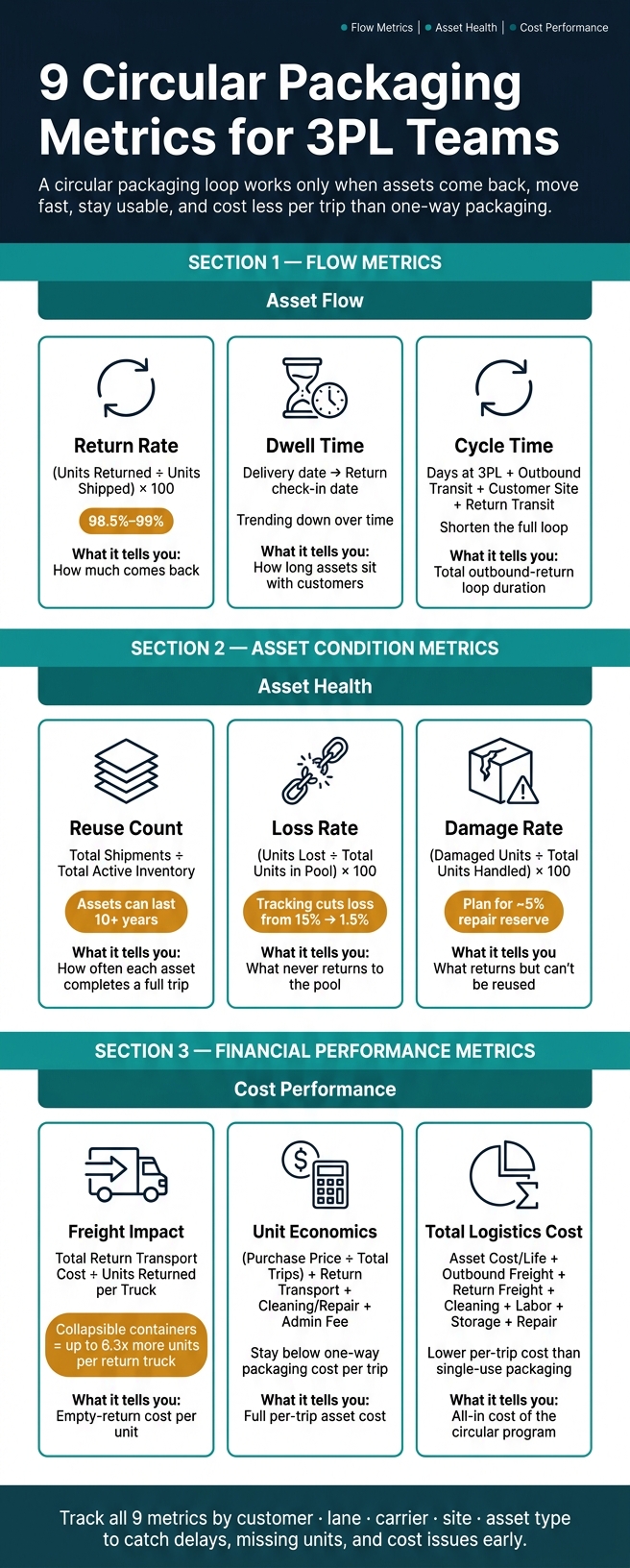
If I had to boil this down to one line, it’s this: a circular packaging program works only when assets come back, move fast, stay usable, and cost less per trip than one-way packaging.
If I’m running a 3PL loop, I’d watch nine numbers first: return rate, reuse count, dwell time, loss rate, damage rate, freight impact, unit economics, cycle time, and total logistics cost. Those metrics show where the loop is slowing down, where assets are leaking out, and where costs start to creep up.
A few numbers in the article stand out right away:
- Return rate target: about 98.5%–99%
- Repair reserve: about 5% of the pool
- Export loop timing: often 21–60 days
- Tracking impact on loss: from 15% down to 1.5%
- Collapsible containers: up to 6.3x more units per return truck
- Asset life: often 10+ years when loss and damage stay low
What I like here is that the article does not treat one KPI as enough. A high return rate can still hide long dwell, slow cycle time, or poor cost per trip. So the smart move is to read these metrics as one set:
- Flow metrics: return rate, dwell time, cycle time
- Asset condition metrics: reuse count, loss rate, damage rate
- Cost metrics: freight impact, unit economics, total logistics cost
9 Circular Packaging Metrics for 3PL Teams: KPI Reference Guide
Building the Future of Circular Packaging
sbb-itb-eafa320
Quick comparison
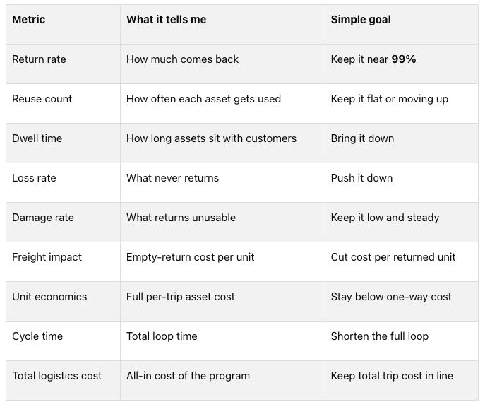 My short take: this article is about control. If I can track these nine metrics by customer, lane, carrier, site, and asset type, I can spot delays, missing units, repair pressure, and cost issues before they turn into stockouts or billing fights.
That’s the core idea of the piece.
Why Circular Packaging Metrics Matter for 3PL Operations
Circular packaging only works when teams can see asset flow in real time. If the data is fuzzy, everything gets harder. Teams can't track asset counts, dwell time, or cost with confidence. And once that happens, problems stack up fast: stockouts, surprise return volume, and labor plans that miss the mark. In most cases, the first warning signs show up in return rate, dwell time, and loss rate.
Returnable transport packaging can cost far less than single-use packaging across its full lifecycle. But that upside isn't automatic. It depends on assets staying in motion. When units sit idle or go missing, they stop producing value. When returns move back faster, that packaging gets back into service sooner. That's why reuse count and cycle time matter just as much as the purchase price. A low sticker price doesn't help much if the asset spends half its life stuck in a yard or lost in transit.
Condition data matters just as much as location data. In food and pharmaceutical logistics, damaged or contaminated assets can lead to compliance failures. Tracking condition helps teams pull damaged units out early, stretch asset life, and protect margins. There's also the cash side of the equation. Circular packaging often uses rental and deposit models where ownership never changes. If teams don't have solid data on dwell times and asset location, invoicing starts to wobble, and disputes usually aren't far behind.
The next section breaks that visibility into nine trackable metrics.
1. Return Rate
Return rate is the share of reusable packaging assets - pallets, crates, and totes - that make it back to the pool after shipment. The formula is simple: (Units Returned ÷ Units Shipped) × 100. Return rate tells you what comes back. Reuse count tells you what keeps working.
This metric shapes one of the most down-to-earth calls in a circular program: how big should the asset pool be? If return rates slip, teams need more buffer stock to keep service levels steady. Most programs set aside about a 5% reserve for damaged or lost units under normal conditions. That’s why it helps to track return rate by customer, carrier, and route instead of looking at one blended number.
The time window matters just as much. An automotive loop might close in 7 days, while an export flow can take 21–60 days. Use the wrong window, and the math gets distorted. Breaking results out by customer, carrier, and route makes it much easier to spot where losses are happening.
A good target is 98.5%–99%, and higher is even better. When return rate starts to fall, it often points to loss, misrouting, or damage. Once the return flow is steady, the next thing to look at is how often each unit gets reused.
2. Reuse Count
Reuse count is the number of times one packaging asset finishes a full round trip before it’s retired. At the fleet level, calculate it as Total Shipments ÷ Total Active Inventory over a set period. Put simply, the point isn’t just that assets come back. It’s how often they come back and go right back to work.
This metric helps with a basic buying call: a higher-priced packaging asset can still be the smarter choice if its longer lifespan brings down cost per use. It also helps to break the data out by container style, supplier, and customer loop. That makes it easier to spot where assets are getting worn out too early or going missing.
Many returnable plastic shipping containers last more than 10 years when loss and damage stay low. The goal is straightforward: reuse count should hold steady or go up. If it drops, that usually points to loss, damage, theft, or slow returns. Faster returns push reuse count higher. Once reuse count is steady, dwell time helps show how long assets sit before they’re used again.
3. Dwell Time
Dwell time is the amount of time a reusable asset stays with a customer before it comes back to the pool. If return rate tells you what comes back and reuse count tells you how often an asset turns, dwell time shows how long that asset is out of circulation. You calculate it by measuring the time from delivery to return check-in.
When dwell time gets too long, 3PL teams usually need more assets moving through the system to keep supply loops going. And that means higher capital costs. To find where the slowdown is happening, break dwell time out by customer, packaging type, lane, and region. That makes it much easier to spot where delays pile up. Tracking the customers or sites that hold assets the longest also helps teams follow up earlier.
Over time, dwell time should go down. If it starts moving up, that's often a sign of slow returns or contract terms that need to be revised. Next, track loss rate to see which assets never come back.
4. Loss Rate
After return rate and dwell time, loss rate tells you which assets never find their way back into the pool.
Loss rate measures the percentage of returnable assets - pallets, crates, and containers - that are lost, stolen, or sent to the wrong place and never re-enter the pool. The formula is simple: (Number of Units Lost During Period ÷ Total Number of Units in the Pool) × 100.
For 3PL teams, this metric points to where money and control are slipping away. It can help you decide whether to invest in RFID or barcode tracking, simplify transport routes, or renegotiate SLAs with pooling providers. And the payoff can be big: automated tracking systems have been shown to reduce asset loss from 15% to as low as 1.5%.
Check loss rate monthly or quarterly, and line it up with the average ship-to-return cycle. That timing matters. If you review it too early, the numbers can look worse than they are. If you wait too long, you may miss a leak that's been draining the pool for weeks.
This metric gets far more useful when you split it by carrier, customer site, and packaging type. That's usually where the pattern shows up. One carrier may have a routing issue. One customer site may be poor at returns. One packaging type may vanish more often than the rest.
Loss rate should move down over time. If it starts climbing, your loop is leaking assets. Next, damage rate shows what comes back but can't be reused.
5. Damage Rate
Loss rate tells you what vanished. Damage rate tells you what came back but still can't go back into service.
Put simply, this metric shows the share of reusable assets - pallets, crates, and containers - that are too damaged to reuse in a given cycle. The formula is straightforward: (Number of Damaged Units ÷ Total Units Handled in the Period) × 100.
A common benchmark for returnable packaging pools is a 5% repair reserve. In plain English, plan for about 5 out of every 100 units to be out of service for repair. That reserve needs to be built into your total pool size from the start.
For 3PL teams, this number does more than sit on a dashboard. It helps answer practical questions like:
- How much buffer stock should we keep?
- Do warehouse teams need better handling training?
- Which routes or sites are putting the most wear on assets?
The metric gets far more useful when you split the data into smaller slices. Look at it by asset type, specific distribution center, transport lane, or handling stage - like loading versus unloading. That's usually where the pattern shows up and where the damage is happening.
It also helps to separate repairable units from units that need to be written off. Repairable units protect margin. Write-offs don't.
What are you looking for over time? A downward trend. If the rate starts climbing, check handling practices, route fit, and asset durability. And when damage goes up, freight impact often becomes the next cost driver.
6. Freight Impact
Freight impact is the reverse-logistics cost of sending empty packaging back for reuse.
Measure it as return cost per unit: Total Return Transport Cost ÷ Units Returned per Truck. This tells you if return trips are efficient enough to protect margin.
Once you have that unit cost, compare it across return methods and lanes to spot the biggest cost leaks. Track freight impact by return method, lane distance, and packaging type so you can see how load efficiency and transport cost stack up.
Packaging design plays a big part here too. Collapsible containers can fit up to 6.3x more units in a return truck than rigid ones, which can cut return cost per unit in a major way. If return cost per unit starts to climb, check units per return truck and confirm that containers are collapsed before return transport.
7. Unit Economics
If freight impact tells you what it costs to move empty assets, unit economics shows the full cost of owning and reusing them. Freight is just one part of the picture. Unit economics adds purchase, cleaning, repair, and admin costs too.
A common formula is (Purchase Price ÷ Total Expected Trips) + Return Transport Cost + Cleaning/Repair Cost + Administrative Fee. Put that number next to the cost of a one-way option, and you get your per-trip savings. It’s smart to track this with reuse count and dwell time, because higher use should push cost per trip down.
This metric helps with a few key decisions:
- choosing between owning assets and a pooling-as-a-service model
- pricing cleaning and repair
- judging whether a lane or packaging type is worth the spend
It also helps you compare total lifecycle savings against ownership and operating costs by using NPV.
Review the metric monthly against your baseline. For planning, model the full container life over 3 to 5 years with NPV instead of simple payback. Then break the data out by packaging type, such as pallets vs. IBCs, lane distance, and industry. That makes it easier to spot where returnables are cost-justified and where they aren’t.
As reuse count goes up, cost per trip should fall, while net savings should go up. One small miss can throw this off, so include retrieval, storage, inspection, and relabeling in the model. If you leave those costs out, your per-trip result will be skewed.
8. Cycle Time
Cycle time measures the full outbound-return loop, including transit, dwell, inspection, and cleaning. The formula is: Cycle Time = (Days at 3PL Facility) + (Days in Outbound Transit) + (Days at Customer Site) + (Days in Return Transit).
Put simply, cycle time tracks the entire loop, not just the trip out. It includes dwell time too.
When cycle time gets longer, companies need larger asset pools to keep service levels steady. Cut that cycle down, and the number of assets needed in circulation drops fast. Shorter cycles also reduce carrying cost, which rolls up into total logistics cost.
Lower cycle time is better. It means more turns per asset and less inventory sitting idle in the system. If you want to see where the drag starts, break the loop into its main phases:
- Outbound transit
- Customer dwell
- Return transit
- Inspection
Then track those phases by customer, carrier, lane, packaging type, and node to spot bottlenecks.
Cycle time tells you how fast assets move through the return loop. Return rate, reuse count, and dwell time show what happens inside that loop. When cycle time stretches, asset availability usually takes the first hit. After that, labor, storage, and transport costs tend to climb too, and those costs feed into total logistics cost.
9. Total Logistics Cost
Total Logistics Cost (TLC) is the all-in cost of keeping reusable packaging moving through the system. It pulls return rate, freight, damage, and cycle time into one number, which makes it a good roll-up metric after you’ve looked at each KPI on its own.
The formula is: Total Logistics Cost = (Asset Cost ÷ Expected Life in Trips) + Outbound Freight + Return Freight + Cleaning Cost per Trip + Sorting/Admin Labor + Storage Cost + Repair/Replacement Cost per Trip.
Make sure TLC includes the day-to-day costs people often miss, such as sorting, marshalling, washing, storage, and empty-container handling.
For 3PL teams, this metric helps answer a simple but expensive question: which return setup makes sense? For example, TLC can help you compare full-truckload (FTL) versus partial-load return strategies and see whether a lane makes financial sense for circular packaging. The goal is simple: get to a lower per-trip cost than single-use packaging. That makes TLC the last cost check before a circular program moves into a larger rollout.
It also helps to break TLC out by route, customer, and packaging type. That’s usually where the weak spots show up. Long return distances and routes with heavy loss tend to drive costs up fast, and those are often the places where the biggest leaks appear.
Metric Reference Guide
The nine metrics fit into three groups: asset health, transportation performance, and financial performance. Breaking them out this way makes it easier to see what needs attention first. If a loop slows down, starts leaking assets, or costs more than it should, these groups help you pick the right KPI to check first.
Asset health tells you if packaging is coming back, getting reused, and staying in usable condition. Use this group to decide when to recover assets, put them back into service, or retire them.
Transportation performance shows how long assets sit idle, how fast they move through the loop, and how well they make it back. Use it to speed up returns and cut idle time.
Financial performance looks at whether the program beats the cost of single-use packaging and whether it stays profitable as it grows. Use it to show that the loop makes sense from a cost standpoint.
When a leading indicator like dwell time or return rate starts moving the wrong way, step in early. Leading metrics help you spot trouble before it spreads. Then use lagging metrics to confirm the cost impact.
How 3PL Teams Build a Metrics Dashboard
Once the nine KPIs are set, the next move is simple: put them into one live dashboard. One view for all nine metrics keeps teams out of spreadsheets when they need basic answers fast. The best dashboards break data out by customer account, ship node, return node, geography, and packaging asset class. That last filter matters a lot. Pallets, crates, IBCs, and collapsible bins don’t move through reverse logistics the same way, and lumping them into one rolled-up number can hide trouble in a hurry.
It also helps to split leading indicators from lagging indicators. Dwell time and cycle time are early signals. They show what’s likely coming next, not just what already went wrong. If assets sit too long at one site, that can point to a coming shortage instead of a simple performance issue. When those numbers start to climb, teams can reserve warehouse space, adjust labor schedules, and trigger return pickups before the asset pool gets stretched too thin.
After those leading indicators set off alerts, teams can use the same dashboard to plan recovery steps. The dashboard should flag exceptions before peak return waves hit. It should also tie planning data to customer return schedules so teams can reserve dock space and cleaning capacity ahead of time. That way, they can step in before shortages, congestion, or billing disputes start spreading.
Conclusion
No single metric can tell you if the circular packaging loop is doing its job.
A high return rate might look good on paper, but it can still hide slow turnaround times, damaged assets, or poor unit economics. That’s why a full KPI set matters. Each metric catches something the others miss. Put them together, and you get a clearer view of whether the loop is actually working.
Seen as one system, these metrics show whether reusable packaging is sound from both an operations and cost standpoint - not just circulating through the network. In plain terms, they show whether reusable packaging is moving, coming back, and earning its keep.
Faster returns get assets back into service sooner. That matters because every extra day out of circulation pushes reuse back.
When teams track these metrics side by side, they can keep packaging moving and cut waste, delays, and cost.
FAQs
Which circular packaging metrics matter most first?
Start with return rate and return volume. These give you a baseline for how many packages come back compared with how many were sold, which helps teams forecast demand and scale infrastructure.
Without a steady return rate - ideally above 90% - the program’s financial and emissions-related gains may not show up. After that, track processing costs, dwell time, and unit economics to improve reverse logistics over time.
How do I know if returnable packaging is cheaper than one-way?
Look past the higher sticker price. Returnables often cost $13.00 to $19.00 per unit, while corrugated boxes come in at about $1.90. That doesn’t mean returnables are a bad deal. It means they only save money when your return loop runs smoothly and stays consistent.
A good starting point is your current annual spend on single-use packaging. From there, model the full lifecycle cost of a returnable system, including:
- purchase price
- expected reuse cycles
- return freight
- cleaning and inspection labor
- loss rates
When you run the numbers, NPV often gives a better read than simple payback. Why? Payback tells you how fast you recover the upfront spend. NPV shows whether the program makes financial sense over time.
What usually causes return rate and cycle time to worsen?
Return rates and cycle times often get worse for a few simple reasons: poor visibility, weak reverse logistics, and container fleets that aren’t managed well.
Return rates tend to fall when customers don’t send empty packaging back or don’t have a clear reason to do it. Cycle times stretch out when assets sit too long, go to the wrong place, or get stuck during intake. Manual counting also slows things down, especially when teams don’t share the same tracking IDs.
Related Blog Posts
Related Articles
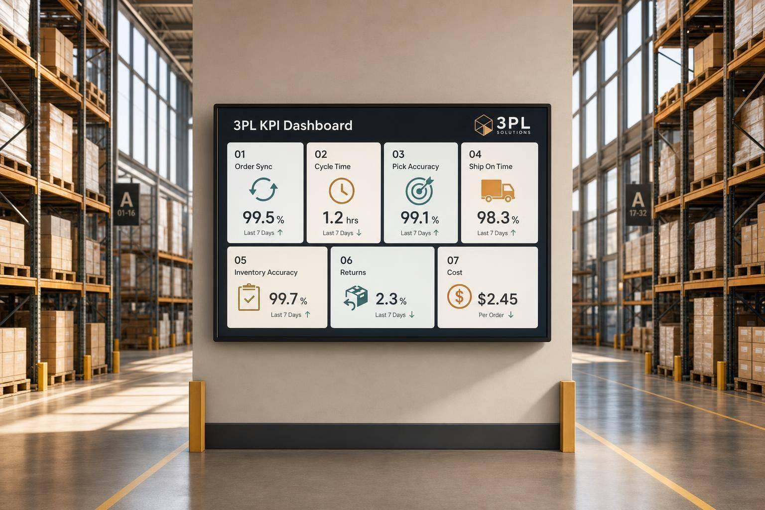
7 WooCommerce 3PL KPIs Teams Track

Centralized vs Decentralized Replenishment
